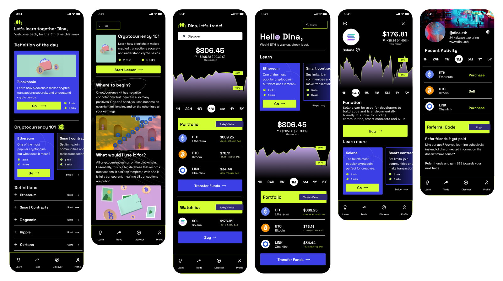
Eddie
A fintech app that teaches people how the market works

How do you make getting into the market feel approachable instead of intimidating?
+ Read more
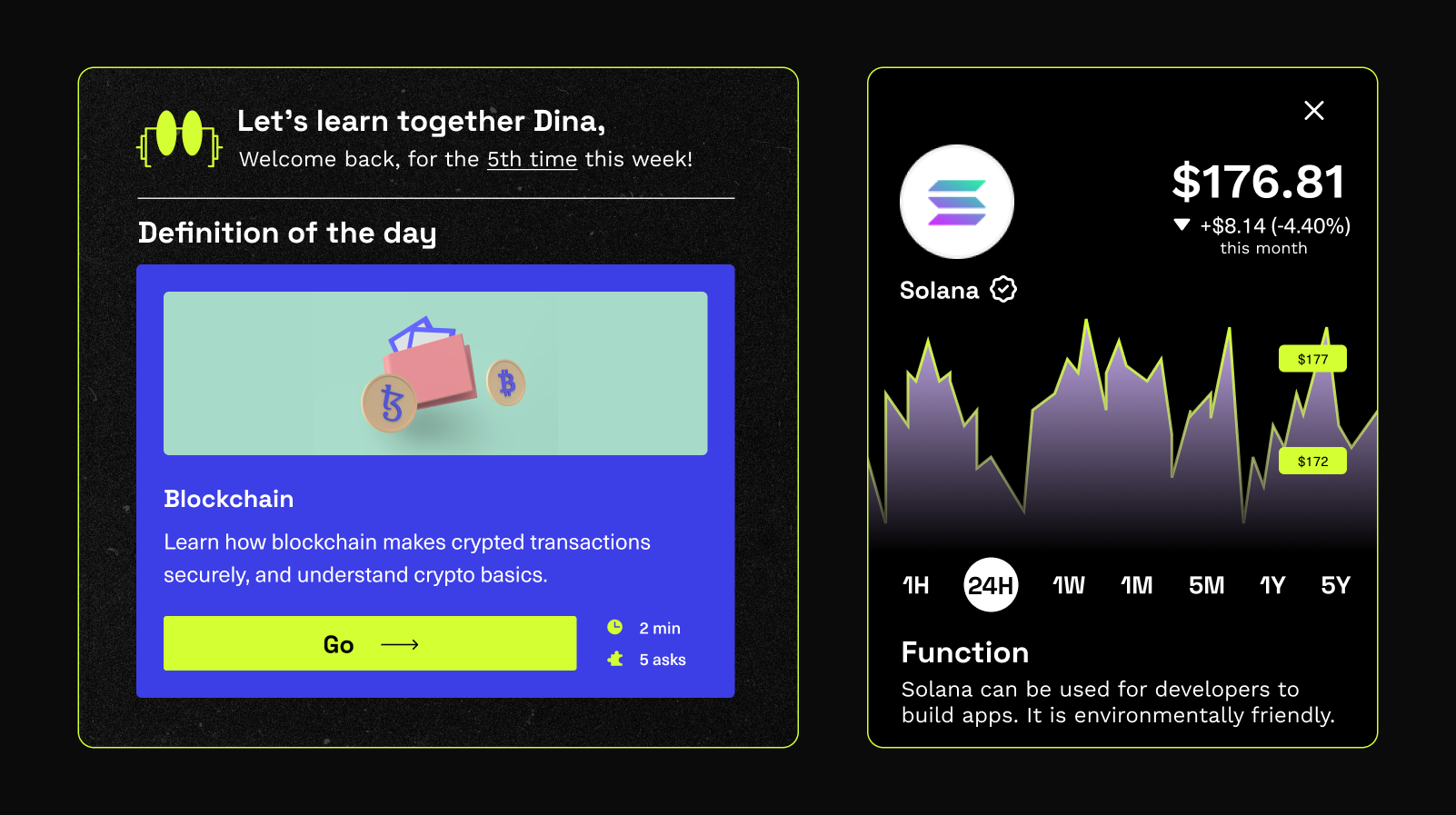
Investors want in on the market. The onboarding doesn’t exist.
+ Read moreSolution
×Investors want in on the market. The onboarding doesn’t exist.
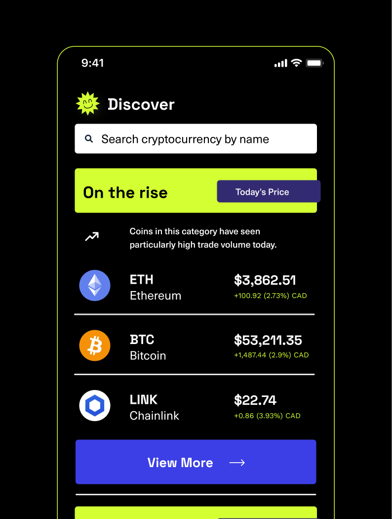
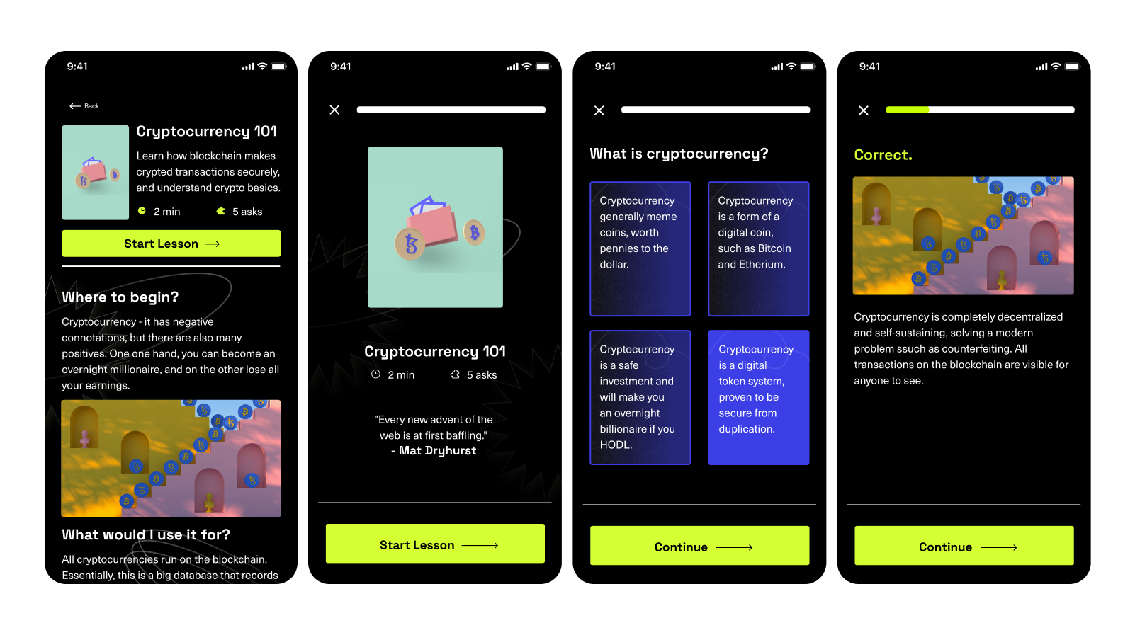
Eddie opened a few doors: segmented education that scales to any emerging market, genuine pull for whatever's emerging next, and an "educate and invest" position that reaches a more open-minded, less transactional investor.
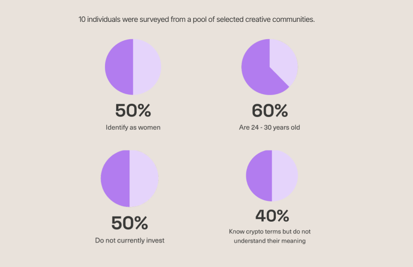
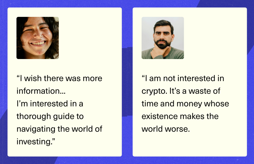
Portfolios split evenly between low-risk and balanced. Active investors checked in 2 to 4 times a week or whenever news hit their holdings. Most people surveyed weren't actively looking to expand into new markets themselves, and those who found a new market confusing usually knew some of the terminology already, they just didn't fully grasp it.

Where the data pointed next
Research

Research
Where the data pointed next
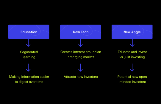
Once the survey showed people wanted deeper education, not just access, it was clear Eddie's value didn't stop at investors already comfortable trading. The same segmented, jargon-free approach that worked here could work for whatever market comes next, and for an industry that still talks past the people it's trying to reach. That widened Eddie from a single product idea into three opportunities: how people learn, what markets they're willing to explore, and how the industry positions itself to reach them.
Beyond users, a new lane for fintech
+ Read moreProcess
×Beyond users, a new lane for fintech
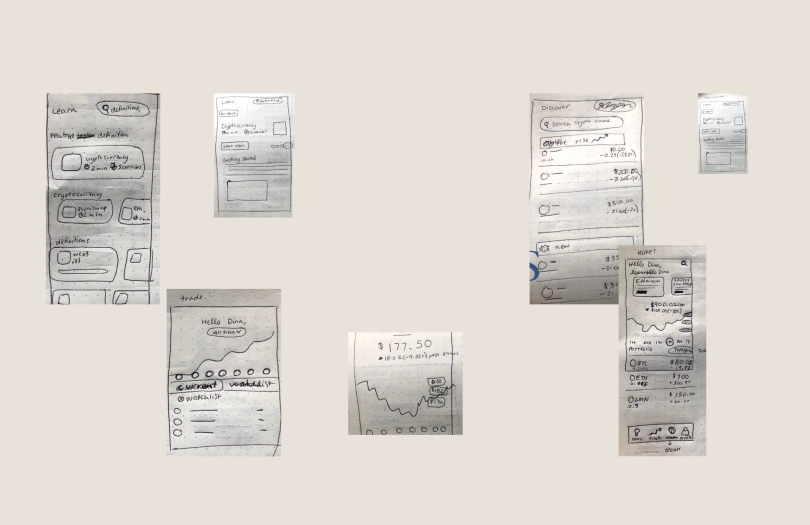
I moved from rough sketches to low-fidelity wireframes before touching visual design, testing flow before deciding what anything looked like. Measure twice, cut once.
Eddie's brand explores texture, color, and an actual face, bright graphic motifs throughout while holding to accessibility standards. The logo is built from vector lines drawn from the letters in "Eddie," straight lines arranged to read as a face, making the brand feel approachable instead of institutional.
This was speculative work with self-imposed constraints. Today I'd pressure-test the "vote on what gets added" feature harder. It reads well as a community feature, but it's also the most exposed to bad-actor manipulation of a thinly traded market, and I'd want a research pass on that risk before shipping it, not after.